Kaizen Network
Brand Kit
Official Kaizen Network logos, colors, and typography. Use these assets when featuring Kaizen Network in your videos, thumbnails, articles, or community creations.
SVG · PNG · 140 KB
Logos
Every logo is available as SVG (scales to any size) and PNG. Pick the variant with the best contrast against your background.
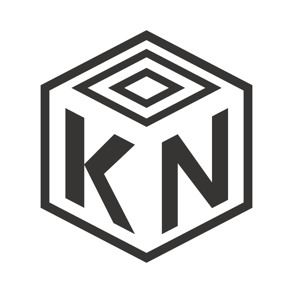
Solid
The primary family. Reach for these first.
Colors
Two colors carry the whole brand. Click a swatch to copy its hex code.
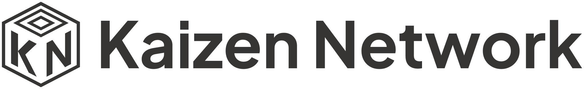
Typography
The wordmark is set in Plus Jakarta Sans Bold. Use it for headings that sit next to the logo; any clean sans-serif works for body text.
Plus Jakarta Sans
Bold · 700
AaBbCcDdEeFfGg 0123456789
Regular · 400
AaBbCcDdEeFfGg 0123456789
Usage Guidelines
Do
- Use the provided files without modification
- Keep generous clear space around the logo
- Pick the variant with the best contrast against your background
- Scale proportionally, preferably from the SVG files
Don't
- Recolor the logo or apply gradients, outlines, or effects
- Stretch, rotate, or distort the logo
- Place the logo on busy backgrounds with poor contrast
- Combine the logo with other marks to imply partnership or endorsement
Philosophy
Why the logo is what it is. Kaizen (改善) means continuous improvement: large things built from small, deliberate, repeated steps. The mark carries that idea in its geometry.
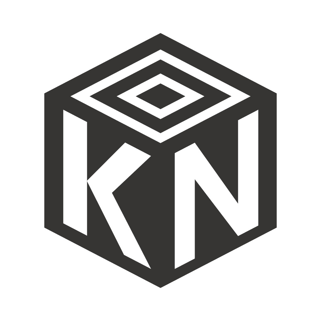
The block is the unit of improvement
Minecraft makes kaizen playable: entire worlds assembled one block at a time. The logo fuses the two ideas into a single block, presented as the thing worth perfecting. Get the smallest piece right, and everything built from it inherits that rightness.
The monogram is in the material
The K and N follow the cube's perspective, skewed with the faces, cut into the block rather than stickered onto it. Identity as substance, not decoration: the network is not a label on the experience, it is what the experience is made of.
A pyramid seen from above
The concentric diamonds on the top face step inward and upward, the terraces of a pyramid seen from above: kaizen made visible, progress that compounds in rings, each level resting on the one beneath it. Read outward they are ripples, one player's idea, one event, one act of helpfulness spreading through the whole server; read inward they are focus, the core everything is built around. Either way the message is the same: there is no final version, the world is always one layer from better.
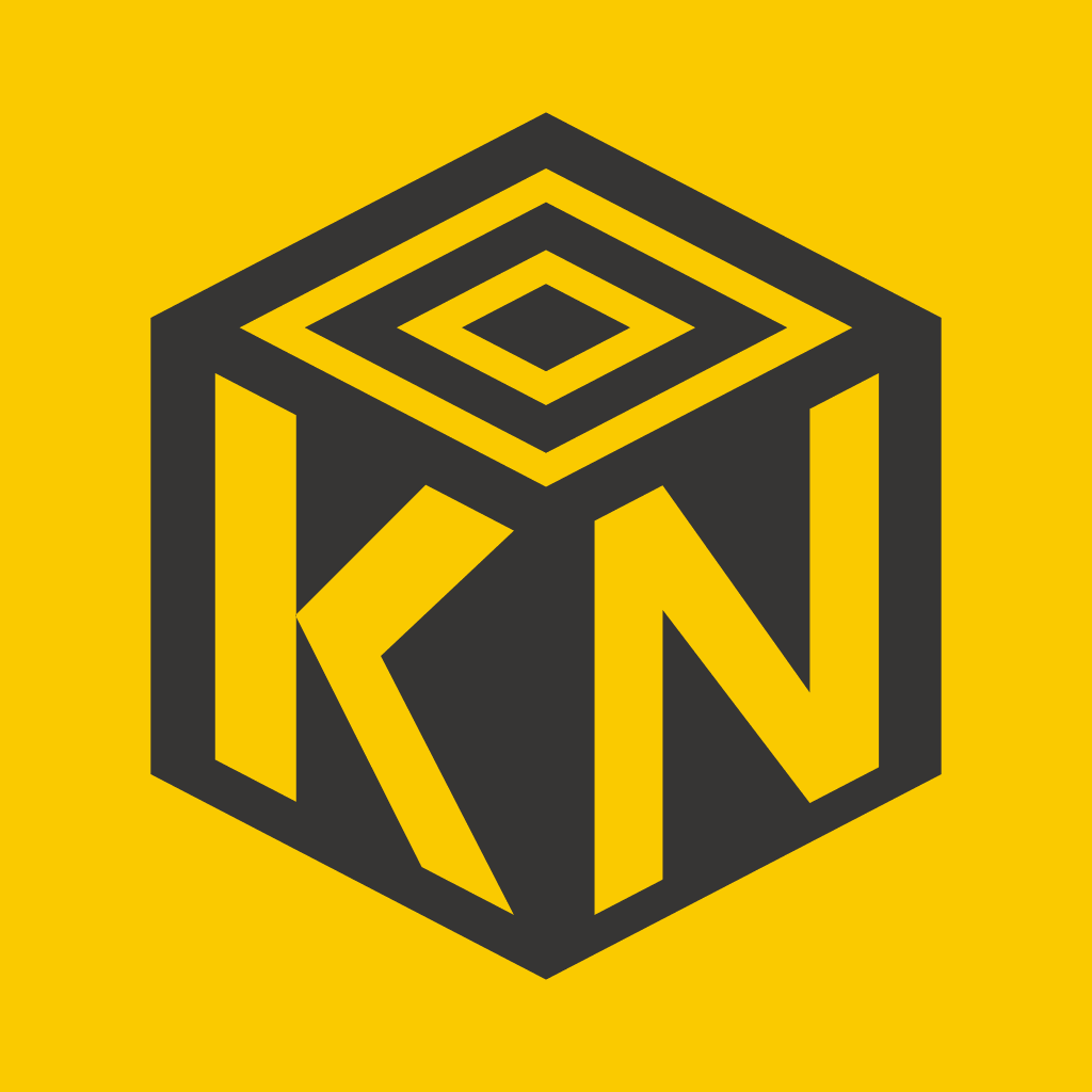
A palette that is mined, not chosen
Gold and charcoal are both dug out of Minecraft's ground: one the reward, one the fuel. Gold used sparingly against a quiet dark base says that value is rare and earned, and the foundation stays understated so it can shine.
Nothing is arbitrary
The two families are one geometry under two renderings. The footprint, the pattern ratio, and the letterforms obey written construction rules that a machine verifies. A logo whose every proportion has a reason is a quiet argument for the server's own values: fairness, consistency, things working the same way for everyone.
The logo is not a finished picture. It lives as parametric source code and improves in small, measured, tested steps. It practices what its name means: the logo is a process, and this is what it looks like right now.
Usage Terms
These assets are free to use when referring to Kaizen Network, for example in videos, thumbnails, articles, and community creations. Do not use them to imply an official partnership or endorsement, and do not use them as the identity of another product or server.